Building a Tooltip Component with React Hooks

A tooltip is a message that is positioned relative to an element on a Graphical User Interface. In this project we will be building a controlled tooltip component with React hooks.
Our tooltip component will by default display the tooltip on hover on the element. We will also be able to control when we open and close the tooltip, and the direction (TOP, BOTTOM, LEFT, RIGHT, TOP RIGHT, TOP LEFT, BOTTOM LEFT, BOTTOM RIGHT) to which we would display the tooltip relative to the element.
Let's have a preview of our demo react app showcasing our tooltip component
Prerequisites:
Approach to Create a Tooltip Component
- Create a tooltip component (Tooltip) that will wrap the element and the content of the tooltip message
- Create a tooltip content component (TooltipContent) that will wrap the actual tooltip message
- Create a tooltip service class (TooltipService) that will control positioning of the tooltip message
- Create a tooltip hook (useTooltip) that will expose methods to open and close the tooltip message with the help of TooltipService
Creating the React Project for Demo
Step 1: Create the react project to demo the tooltip component we will build
npx create-react-app tooltip-demo

cd tooltip-demo
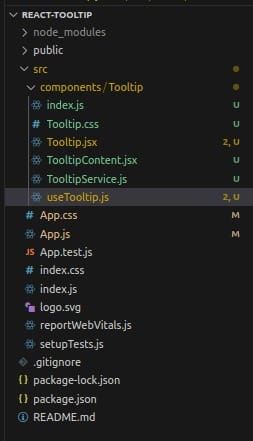
Step 2: Create the Tooltip components, hooks and services in a components directory
Here is how the project structure should look like
Step 3: Let's Create the tooltip service (TooltipService) with the following code
// TooltipService.js

export const Position  = {
  TOP: 0,
  TOP_RIGHT: 1,
  RIGHT: 2,
  BOTTOM_RIGHT: 3,
  BOTTOM: 4,
  BOTTOM_LEFT: 5,
  LEFT: 6,
  TOP_LEFT: 7,
}

class TooltipService {
    static POSTION_GAP = 5;

    static getTooltipPosition (tooltipEl, position) {
        const elRect = tooltipEl.getBoundingClientRect();
        const containerElRect = tooltipEl.parentElement.getBoundingClientRect();

        const defaultPosition = {
            bottom: -1 * (containerElRect.height + this.POSTION_GAP),
            left: '0'
        }

        if (position === Position.TOP) {
          return {
            top: -1 * (elRect.height + this.POSTION_GAP),
            left: '0'
          }
        } else if (position === Position.TOP_RIGHT) {
          return {
            top: -1 * (elRect.height + this.POSTION_GAP),
            right: -1 * (elRect.width + this.POSTION_GAP)
          }
        } else if (position === Position.BOTTOM_RIGHT) {
          return {
            bottom: -1 * (containerElRect.height + this.POSTION_GAP),
            right: -1 * (elRect.width + this.POSTION_GAP)
          }
        } else if (position === Position.BOTTOM_LEFT) {
          return {
            bottom: -1 * (containerElRect.height + this.POSTION_GAP),
            left:  -1 * (elRect.width + this.POSTION_GAP)
          }
        } else if (position === Position.TOP_LEFT) {
          return {
            top: -1 * (elRect.height + this.POSTION_GAP),
            left: -1 * (elRect.width + this.POSTION_GAP)
          }
        } else if (position === Position.LEFT) {
          return {
            top: '0',
            left: -1 * (elRect.width + this.POSTION_GAP)
          }
        } else if (position === Position.RIGHT) {
          return {
            top: '0',
            right: -1 * (elRect.width + this.POSTION_GAP)
          }
        } else {
          return defaultPosition;
        }
    }
}

export default TooltipService
The above class exposes a static field (POSITION_GAP) to determine by how much distance in px the tooltip message should be away from the element and a static method (getTooltipPosition) that receive a reference to the tooltip message element and the expected display position to determine the position where we will display tooltip message
For readability and maintainability, we have exported a Position object that self explains the direction to which we want the tooltip message displayed
Step 4: Let's create the tooltip hook (useTooltip) that will help expose methods for opening and closing the tooltip message
// useTooltip.js

import TooltipService, { Position } from './TooltipService';

const hideTooltip = (tooltipEl) => {
    tooltipEl.classList.add('hide');
    tooltipEl.classList.remove('show');
}

const showTooltip = (tooltipEl) => {
    tooltipEl.classList.add('show');
    tooltipEl.classList.remove('hide');
}

const useTooltip = () => {
    const renderTooltip = (tooltipRef, isOpen, position) => {
        if (isOpen) {
            const tooltipPosition = TooltipService.getTooltipPosition(tooltipRef.current, position ? position : Position.TOP);
            if (tooltipPosition.top) {
                tooltipRef.current.style.top = `${tooltipPosition.top}px`;
                tooltipRef.current.style.bottom = null;
            }
            if (tooltipPosition.left) {
                tooltipRef.current.style.left = `${tooltipPosition.left}px`;
                tooltipRef.current.style.right = null;
            }
            if (tooltipPosition.right) {
                tooltipRef.current.style.right = `${tooltipPosition.right}px`;
                tooltipRef.current.style.left = null;
            }
            if (tooltipPosition.bottom) {
                tooltipRef.current.style.bottom = `${tooltipPosition.bottom}px`;
                tooltipRef.current.style.top = null;
            }
            showTooltip(tooltipRef.current)
        } else {
            hideTooltip(tooltipRef.current)
        }
    }
    return (elementRef) => {
        return {
            open: (position) => renderTooltip(elementRef, true, position),
            close: () => renderTooltip(elementRef, false)
        }
    }

}

export default useTooltip
Step 5: Let's create the tooltip component (Tooltip) and the tooltip content component (TooltipContent)
The tooltip component will wrap the element that requires a tooltip display while the TooltipContent will display the tooltip message passed to the Tooltip component
// TooltipContent.jsx

import React, { forwardRef } from "react";
import "./Tooltip.css";

const TooltipContent = forwardRef((props, ref) => {
    return (
        <>
            <div ref={ref} className="tooltip-wrapper bottom hide">
                {React.isValidElement(props.content)
                    ? props.content
                    : <div className="content-wrapper">{props.content}</div>}
            </div>
        </>)
})

export default TooltipContent;

// Tooltip.jsx
import React, { forwardRef, useRef } from "react";
import "./Tooltip.css"
import TooltipContent from "./TooltipContent";
import { Position } from "./TooltipService";
import useTooltip from "./useTooltip";

const Tooltip = forwardRef(({content, position, children}, ref) => {
    const elRef = useRef();
    const tooltip = useTooltip();
    const handleMouseEnter = () => {
        tooltip(ref).open(position)
    }
    const handleMouseLeave = () => {
        tooltip(ref).close();
    }
    return (
        <div className="container">
            <div onMouseEnter={handleMouseEnter} onMouseLeave={handleMouseLeave} ref={elRef} className="tooltip-element">
                {children}
            </div>
            <TooltipContent ref={ref} elRef={elRef} position={Position.TOP} content={content}></TooltipContent>
        </div>
    )
})

export default Tooltip;
/* Tooltip.css */
.container {
position: relative;
width: fit-content;
}
.tooltip-wrapper {
position: absolute;
width: max-content;
}
.tooltip-wrapper.show {
visibility: '';
}
.tooltip-wrapper.hide {
visibility: hidden;
}
.content-wrapper {
background-color: rgba(0, 0, 0, 0.6);
font-size: 0.8rem;
color: #fff;
width: fit-content;
padding: 8px;
border-radius: 4px;
}Final Step: Let's update the App.js file to use our tooltip component and utilities to demonstrate
We will use a select field to change the direction to which we want to display the tooltip message relative to the element
// App.js

import Tooltip from './components/Tooltip';
import './App.css';
import { useRef, useState } from 'react';
import { Position } from './components/Tooltip';
import useTooltip from './components/Tooltip/useTooltip';

function App() {

  const tooltip = useTooltip();
  const tooltipEl = useRef();
  const [position, setPosition] = useState(Position.TOP);

  const handleChange = (event) => {
    setPosition(+event.target.value);
  }
  return (
    <div className="App" style={{display: 'flex', justifyContent: 'center', alignItems: 'center', flexDirection: 'column', height: '100vh'}}>
      <Tooltip ref={tooltipEl} position={position} content={<h2>Hello!! I am a tooltip message.</h2>}>
         <h2>TOOLTIP DEMO</h2>
      </Tooltip>
      <div style={{marginTop: '200px'}}>
        <select name="position" onChange={handleChange} value={position}>
          <option value={Position.TOP}>TOP</option>
          <option value={Position.BOTTOM}>BOTTOM</option>
          <option value={Position.LEFT}>LEFT</option>
          <option value={Position.RIGHT}>RIGHT</option>
          <option value={Position.TOP_RIGHT}>TOP RIGHT</option>
          <option value={Position.TOP_LEFT}>TOP LEFT</option>
          <option value={Position.BOTTOM_LEFT}>BOTTOM LEFT</option>
          <option value={Position.BOTTOM_RIGHT}>BOTTOM RIGHT</option>
        </select>
        <button onClick={() => tooltip(tooltipEl).open(position)}>SHOW TOOLTIP</button>
      </div>
    </div>
  );
}

export default App;
Start the react project
npm run startYou can find the complete project on github